In the quest to cultivate a high-performing website, there are many elements that must be considered. Of course, the key to sustaining visitors and retaining their attention is based in the design of each page. While there are numerous categories and design tips you can follow, the most effective tip – especially for those who feature content heavy websites – is laying out content according to how the majority of Internet users read.
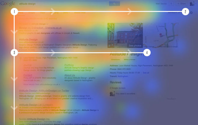
According to the latest eyetracking studies, where researchers monitored the areas of a website the majority of visitors look when the page first loads, the typical user reads content in an “F-pattern.” This is to suggest that when your website loads, their eyes move along two horizontal lines immediately followed by a vertical column. This F-pattern holds the key of enhancing user engagement while simultaneously stimulating your conversions as you’re able to customize the information laid out based upon their natural reading style.
The Three Components of F-Pattern Reading
This dominant reading pattern exists across all industries and demographics. As mentioned earlier, the typical user consumes written content and all accompanying visuals within an F-Shape. This unique reading pattern can be broken down into three primary components:
1.) First Horizontal Movement – When the website loads, the user typically scans across the upper portion of the primary content area. This is where you should place the most imperative words and information as this sets the stage regarding your authority and whether or not the user believes their questions/needs will be satisfied.
2.) Second Horizontal Movement – This area is typically found immediately beneath the first horizontal movement, but it generally doesn’t extend as long to the side. The overall website “real estate” covered in this second movement is shorter, much like the lower horizontal line in the capital letter “F”. This is where you should place supporting information that further intrigues readers; however, you should not be too obtuse regarding the phrasing. The most successful implementation of this design pattern are websites that utilize the second horizontal line as a means of providing further details to satisfy the primary question/need of a website visitor.
3.) Vertical Movement – Finally, after satisfying the first two movements, users will briefly scan the left side of the content. Typically, users are searching for bulleted lists that contain keywords and key phrases. Within this section, you must maximize their vertical scanning by avoiding pictures and other media and providing an easily readable list of essential pieces of information.