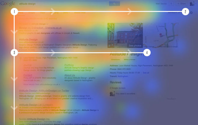
The secret to securing your success in our digital realm isn’t much of a secret. The overall success rate of your website boils down to three primary elements: design, content, and speed. The visual design and layout of your website determines whether or not a visitor will continue to explore its pages while the content is used to solidify visitor interest. However, if you have a terrible website design, then it doesn’t matter how eloquent or breathtaking your content may be. In all likelihood, no one will go past the front page.
Throughout this article we’re going to delve into the various design elements that are considered not only the most common, but also the most costly, mistakes. If you’re serious about creating an effective and powerful website, then you must spend as much time working to avoid these mistakes as you do working to create a new and vibrant website.
Mistake #1 – Overused PDF Files
The majority of website visitors loathe PDF files to gain access to standard information. The primary reason for this is because PDF files disrupt their reading flow. The last thing you want to do is implement a design strategy that inhibits easy reading. The disconnected navigation and irregular formatting of PDF files is among the quickest way you can ruin user engagement.
Mistake #2 – Walls of Text
This is considered one of the most erroneous mistakes within the website design world. When was the last time you came across a giant wall of text and thoroughly read it? The answer is likely never. The average internet user simply scans content to grab bits of information they find useful. However, if the information is lost within a wall of text, this level of interaction is inhibited. More times than not, a user will simply exit a website before attempting to read a block of text. Break your text up into smaller paragraphs and utilize sub-headings and bullet lists.
Mistake #3 – Unwavering Font Size
Perhaps the most annoying encounter a website visitor will experience is font size that doesn’t adjust based upon the device they’re using or their browser settings. If you choose to utilize static font sizes, you’re putting the needs of your visitors in the background. One of the pillars of effective website design is respect. Therefore, you must respect visitor preferences when it comes to text size and allow them to resize text to fit their specific needs. Actively specify font size not in a fixed number of pixels, but rather in relative terms.
Mistake #4 – Bulky Unoptimized Design
Whether you use a generic third party template from a company like ThemeForest or you build something from scratch, a very common mistake we see in web design is unoptimized design. This can include bulky CSS that isn’t minified, too many JS calls, or even redirect strings within the site’s own code. Unless you have the world’s fastest web hosting then you’re most likely bogging down your website. To test the speed of your website, consider a tool like Pingdom to run one-off tests. Then you can adjust your code, install a caching plugin and make server tweaks, then re-test and see how your site’s speed has improved.

